The Problem
A business user notices a KPI is wrong before the data team does. The actual failure could be any of the following:
- The same metric reads differently on two tabs of one dashboard, or on several different dashboards.
- A Denial Rate metric tile that normally moves 3-5% night-over-night suddenly jumps 40%.
- One state’s numbers spike to several times their norm (7-day average) while the company-wide total looks unremarkable enough that nobody would think to check.
- A business user finds one column in a dashboard dataset that changed from 18% null values to 86% null values, when it normally remains stable.
Every one of these is commonly found by a person consuming a dashboard, reported as “the numbers look wrong,” and then traced back by the data and analytics team after the fact. The trace itself costs hours. The part that doesn’t get undone is the loss in trust and reputation damage to the data and analytics team.
Source-table data quality tools do not catch this, and it is worth being precise about why. A table-level check validates a table: schema, nulls, row counts, referential integrity, expectations against known columns. A KPI tile on an AI/BI dashboard is not a table. It is a measure expression, bound to a dataset’s SQL, filtered by dashboard parameters, rendered as a single number. Two more places exist for that number to go wrong between a clean source table and a correct-looking tile, and neither of them is a table a data-quality framework can point at. 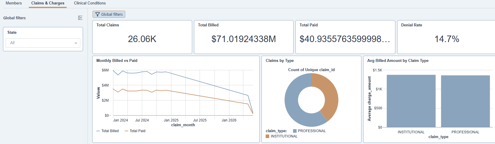
Three layers, one number
Start from the source and follow a KPI to the screen. A dashboard’s dataset issues its own SQL against Gold or Silver tables: joins, filters, a RANGE date parameter, a MULTI select. That query can drop rows, fan out a join, or silently change what a column means, independent of whether the underlying tables are perfectly clean. The result of that query is itself a dataset with its own row count, its own null rates, its own distribution, and none of that exists as a table anyone’s data-quality framework is watching, because it is defined entirely inside the dashboard’s own .lvdash.json file.
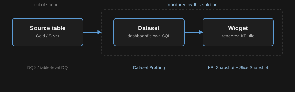
Past the dataset sits the widget. A counter tile binds a measure expression to that dataset, applies its own filters and period logic, and renders one number. The same governed KPI can be wired up as two different measure expressions on two different dashboards, or the same expression with two different parameter defaults, and both tiles will confidently render a number. Nothing about either tile is malformed. They just disagree, and disagreement between two correct-looking numbers is not a data-quality problem in the traditional sense at all.
That gives three layers where something can break: the source tables, the dashboard’s own derived dataset, and the widget metric rendered from it. This solution deliberately covers the second and third. The first — source tables in _gold/_silver — is explicitly out of scope, and stays there on purpose: dedicated table-level data-quality tooling on Databricks (DQX and similar expectation-based frameworks) already understands schemas, keys, and business rules at that layer, and a monitoring product bolted onto dashboards has no comparative advantage rebuilding it. What that tooling structurally cannot see is a dashboard’s own query logic and a tile’s own measure binding, because those never materialize as a table at all. That is the gap this solution fills, and only that gap.
The dataset layer: profiling what a dashboard’s own query produces
The first monitored layer is the dataset a dashboard’s SQL actually returns, not the source table it reads from. Every night, the profiling pipeline locates each configured dashboard’s .lvdash.json, materializes every dataset’s base query with its parameters bound to real values, and profiles what comes back: row count, per-column null and distinct percentages, numeric statistics (mean, standard deviation, percentiles, skewness, kurtosis) for numeric columns, and top-K value counts plus Shannon entropy for categorical ones. Wide datasets skip histogram and duplicate-row computation rather than run unbounded; complex struct/map/array columns get rendered to a string for profiling rather than failing the run.
Six named alerts fire off configured thresholds on top of those statistics: missing (a column that’s entirely or mostly null), constant (a single distinct value), high-cardinality, unique (every value distinct), imbalanced (one value dominates more than 90% of rows), and skewed (|skewness| > 2). Results are written in long format, one row per (run, dataset, scope, column, metric), specifically so a new metric never requires a schema change.
The reason this layer exists separately from source-table monitoring is that a dataset’s own query is where a whole class of problems originates that never touches the source table at all. A dashboard’s join can start fanning out rows this month in a way it didn’t last month, without a single upstream table changing. A parameter default can silently narrow what a dataset returns. A dataset’s null rate can spike because a filter condition changed, not because the column it filters on did. Table-level profiling on the source would show nothing wrong, because nothing is wrong there. The distortion lives entirely in the dashboard’s own derived query, which is exactly the layer this pipeline profiles. ## The widget layer: recomputing every tile from its live definition
The second monitored layer is the rendered KPI tile itself, computed twice a night by two independent pipelines: once company-wide, once sliced by office and region.
The company-wide pass parses every dashboard’s live definition, extracts each dataset’s base SQL and measure expressions, and flattens every page to its widgets, keeping only single-value counter tiles (bars, lines, and tables are excluded by design). For each tile it binds dashboard parameters to concrete SQL literals, resolves the measure expression (recursively, so a composite measure that references other measures still expands to one standalone query), resolves which period applies, and executes the recompilation directly against the dataset’s base query. Nothing about a tile’s value is hardcoded per metric. The pipeline reads the dashboard’s own definition and recomputes from there, so a formula change on the dashboard is picked up automatically on the next run, without a corresponding code change in the monitoring pipeline.

.lvdash.json definition, matched to governed definitions, and written to dashboard_kpi_snapshot.The slice pass computes the same tiles grouped by whatever state or region attribute that is relevant for a client (Think global filters on a dashboard - configured as parameters to the job ). The dataset’s live schema resolves, deliberately as a separate, non-importing pipeline so a failure in one can never take down the other. Each slice’s roll-up (ratio-of-sums for ratio tiles, a plain sum for count tiles) gets reconciled against the company-wide value for the same tile and period, and the reconciliation result is recorded as reconciling, a real mismatch, or an expected divergence (a distinct-count measure that legitimately fans out across offices reconciles as “expected,” not as a defect).
Both pipelines write to Delta tables that, on their own, just accumulate trended history. What turns that history into something a person acts on is a fourth nightly task, described next, that reads it back the same night.
Detection, governance, and delivery
A nightly monitoring_detection task runs after the three collection tasks finish, reading that same night’s kpi_snapshot, kpi_slice_snapshot, and profile_metrics output and writing flagged incidents to one unified table, monitoring_flags. Four flag types cover the failure modes named at the start of this post:
- CONSISTENCY (the same metric reading differently across dashboards or tabs)
- ANOMALY (a night-over-night swing past a metric’s normal range)
- SLICE_DEVIATION (a single office or region breaking from its own baseline while the company-wide number looks normal)
- DRIFT (a dataset-level row-count swing, or a column-level shift in null rate, mean, or skewness, run-over-run)
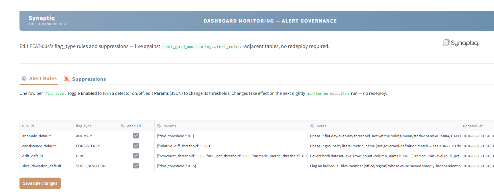
Each of these ‘Types’ of checks can have multiple rules defined to check for very specific parameters. Every threshold behind those four checks is a documented in an ‘ALERT Rules’ Table. Users can define explicit thresholds, or alternatively statistically derived rolling bands can be used. Examples: a metric moving more than 10% day-over-day trips an ANOMALY type flag, or a15% Change for an underlying slice (Region / State) trips SLICE_DEVIATION, or null-rate swing of 30% ( a Column went from having 20% Null Values to 50% Null) trips a DRIFT type flag, and a 0.1% relative disagreement between the same metric on two tiles trips a CONSISTENCY type flag. Additionally, suppression rules can be added to suppress alert notifications on metric mismatches if for example; a known mismatch exists and will always trigger and notifications should be skipped for it.
A Databricks App called alert-governance, allows users to add / update / edit rules for alerts and suppressions (stored in underlying delta table). This App reads and writes the underlying rules and suppressions to delta table directly. One tab lets a user toggle a flag type on or off and edit its threshold parameters, the other lets them add a suppression scoped to any combination of dashboard, tab, widget, metric, slice, dataset, or column, each with a required reason and owner and an optional expiry. A change made in the app takes effect on the next nightly run. The rules table is seeded once from a checked-in YAML file, and only ever by insert, never by update, specifically so a later re-seed can never silently overwrite an edit the app already made.
A flagged, unsuppressed incident still has to reach a person, and that part is native Databricks SQL Alerts. SQL Alert queries monitoring_flags table about 30 minutes after the nightly job finishes, checks whether an unsuppressed flag exists for the latest run, and fires. These notifications can be distributed through multiple channels; email (by default), Teams Channel, Slack. A one-time, workspace-level configuration is all that is required for Teams or Slack Channel distribution.
Where this helps
None of this replaces table-level data-quality tooling, and it isn’t meant to. DQX-style expectation checks on _gold/_silver tables remain the right tool for catching a broken upstream pipeline, a schema change, or a constraint violation at the table it happened to. What they cannot see is a dashboard’s own derived dataset query or a tile’s own measure binding, because neither one is a table. This solution starts exactly where table-level checks run out of visibility: it profiles what a dashboard’s query actually returns, recomputes what a widget actually renders, and now flags the result and puts it in front of a person, all from the dashboard’s live definition rather than a hardcoded formula that drifts out of sync the first time someone edits a tile.
The Real Value
With a nightly record of KPI values and dataset health and snapshots of accumulating history, Data and analytics teams have tools to build End user trust. Every incident an end user finds first costs the data and analytics team an explanation after the fact, and no explanation fully undoes the fact that the end user found it first. A monitoring layer that reaches a person overnight, at the two layers no table-level check can see, is what turns “trust us, the dashboard is right” into something the data and analytics team can actually verify and stand behind.